Landing Page
When you access foresight.ffm.vic.gov.au/app/ via a FireWeb log in, you will be navigated to a landing page. The landing page will direct you to select the version you would like to access: Bushfire, Planned Burning or Hindsight1. The landing page will also show a disclaimer box overlaying a grey map of Victoria (Figure 2).
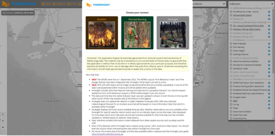
Figure 2. Landing page of Foresight, automatically navigated to after log in with FireWeb credentials
1 As of October 2022, Hindsight is a planned functionality that has not yet been implemented and will be released as a new Foresight version in 2023.
Map View
Once a Foresight version has been selected, you will be able to see the map of Victoria. Select an indicator from the Indicator drop-down list to get started. This will add data to the map and cause the time bar to appear.
Figure 3 and Table 1 provides information on the features accessible from the map display. Detailed information about each feature is shown in numbered sections, with numbers matching the numbers used in the figure and table.
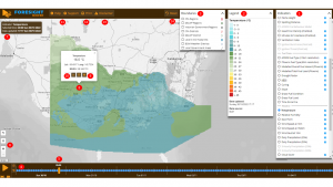
| 1 – Indicators
The ‘Indicators’ drop-down includes a range of fire weather variables and risk indices commonly used by emergency services in Victoria. An indicator can be displayed on the map by selecting an indicator from the list in the drop-down. This drop-down is organised into groups. Only one fire indicator or weather indicator can be displayed at a time. The exception to this are the ‘Weather Overlays’ and ‘Incidents’ layer groups, which can be displayed on top of a single spatial data layer. |
2 – Legend
The ‘legend’ drop-down displays the legend of the indicator. Units of measurement are displayed next to the indicator name. The colours and classes in legends are generally consistent with existing BOM, CFA or DELWP products. The legend drop-down includes the source of the data and the time and date of when that data was created at the source location. It is important to note that the data for the current and coming six days is sourced from the most recent forecast files available; this is the date and time shown in the legend. Modelled data displayed for the previous two days is sourced from the last created forecast for those days. |
| 3 – Boundaries
Using the ‘boundaries’ drop-down, several agency administration boundaries are available to view on the map. Multiple boundary layers can be switched on at once. |
4 – Time step
The vertical orange marker in the time bar identifies the selected ‘time step’. The ‘time step’ shows the time/date of the forecast being displayed. You can click anywhere along the time bar to shift the time step. It is also possible to move to a different time step by clicking within a meteogram (refer to Meteograms). |
| 5 – Time bar
When an indicator is selected, the time bar appears. The time bar includes a nine-day period: two days prior to today, today, and six days ahead. The time bar will automatically be positioned at the current date and hour when you open or refresh Foresight. |
6 – Zoom
The ‘plus’ and ‘minus’ zoom buttons allow a user to zoom in and out in the map window. The scroll wheel on your mouse can also be used to zoom and pan in the map. |
| 7 – Data info box
Names the active indicator layer and gives relevant time stamps. |
8 – Cell data
In the map, you can click your mouse to select a point location.
|
| 9 – Expand
In the cell pop-up, the ‘expand’ button can be clicked to open a secondary pop-up which displays the numerical values for all fire and weather indicators for the cell for which the selected point falls within. |
10 – Meteograms
In the cell data pop-up, the ‘graph’ button can be clicked to open the meteogram window. A meteogram is a graphical representation of one or more meteorological variables with respect to time, whether observed or forecast, for a location. It is useful for viewing a trend in weather variables and indices and how they may be interacting over time. This can be important for identifying risks in fire behaviour, such as a lack of overnight recovery. |
| 11 – Assistance buttons
Links to the user help page and application support page. |
12 – Print button
Opens a print dialogue box. |
| 13 – Disclaimer
Re-opens the landing page. |
14 – Reset button
Switches off the active layer and any overlays. |